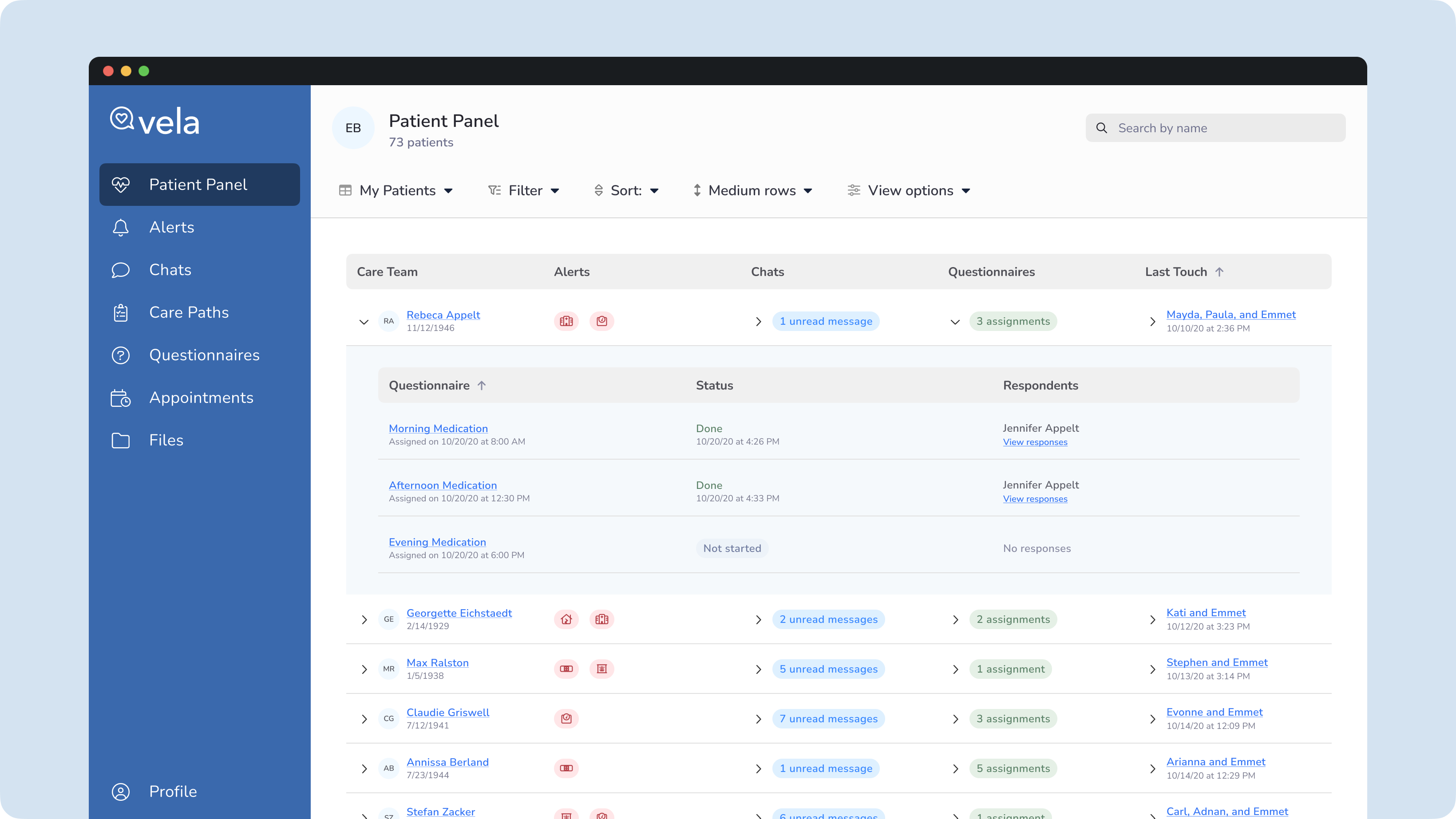
Vela Patient Panel

Enables Care Managers to efficiently manage their caseloads at scale according to need

Vela Patient Panel

The Business Problem

Typically, a Care Manager and Coach's initial task is to review and triage patient activity for incidents and critical events. Care teams, comprising various healthcare professionals centered around the patient, rely on multiple data points to gain a comprehensive understanding of the patient's health.

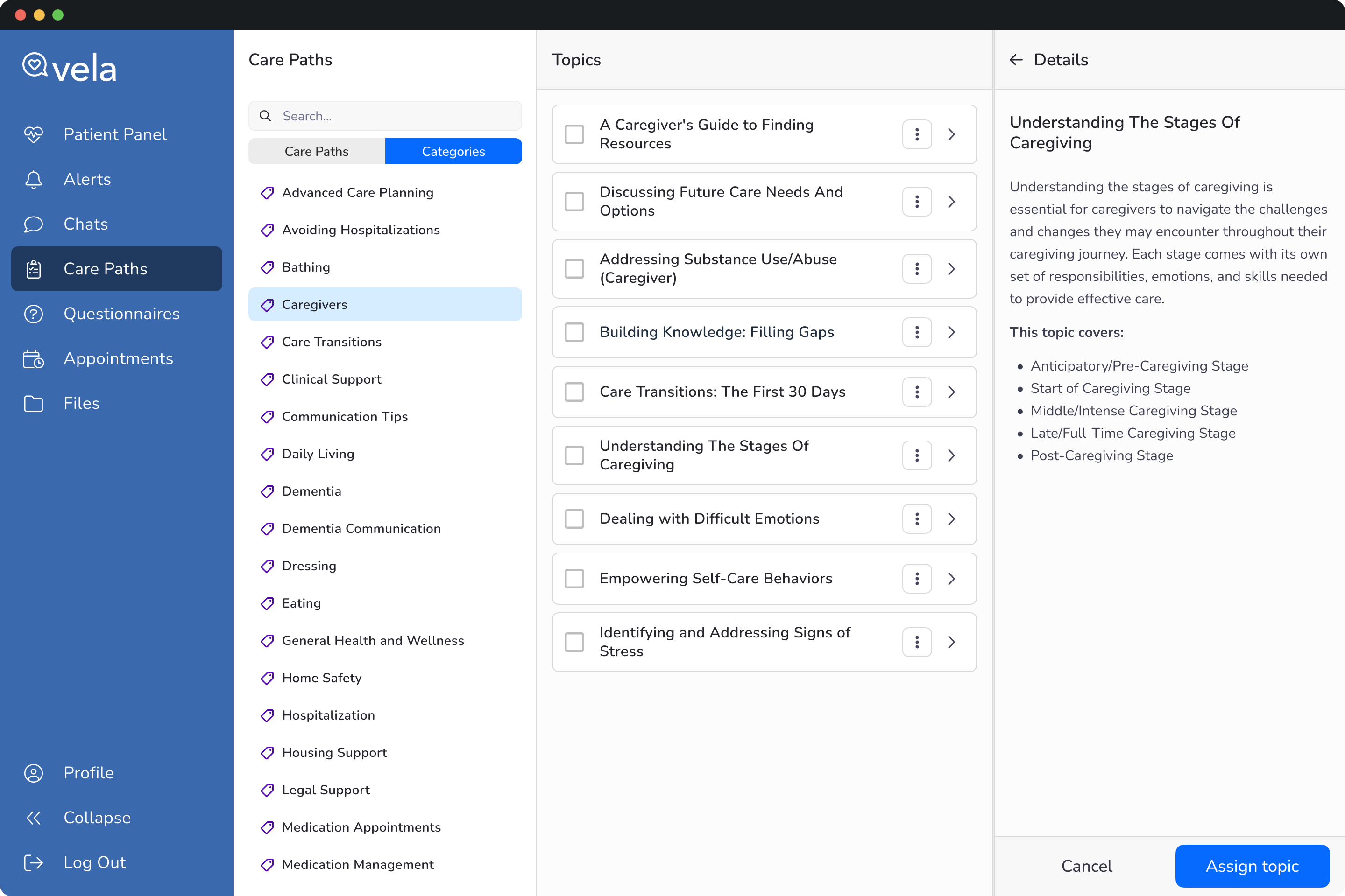
For instance, Vela Pro displays activity through indicators for new chat messages and alerts for questionnaire submissions. These features are organized in a dedicated space within the app, allowing professionals to focus on their tasks.

However, a decentralized structure has made it challenging for professionals to get an overview of care team activity and has hindered their ability to triage care based on need.

View-all permissions: Branch Managers have read-only access to view the Care Teams managed by their Professionals. We also had to consider the functionality governed by this permission.

Additional use cases: While Vela Pro is designed for durably assigned caseloads, we must also accommodate other care models that meet our customers' diverse needs.
Overview

My role

Senior Product Designer

Team

1 Product Manager, 6 engineers, subject matter experts

Duration

2 quarters

Process overview

Product thinking, sketching, primary and secondary research, visual design, prototypes for feature validation, SME feedback sessions

Personas

Branch Manager, Care Manager, RN Care Manager, Care Coach, Care Coordinator

My Process

Outcome statements

  • Professionals can manage their caseloads efficiently at scale from a single view.
  • Professionals can view their panel based on personal preferences, workflows, or program goals.
  • Branch Managers need to view a Professional's panel for caseload balancing, assessing coverage needs, and reviewing care team activity.

Technical constraints

  • Performance requirements: data might come from Vela Pro, a system of record, or other services. We need to ensure the Panel will be performant. Working closely with Engineering around this topic was essential.
  • Data failures: we want to ensure that if one service fails, it doesn't kill the entire Panel service. If a failure does occur, how can we allow the Pro to recover from that?
  • No machine learning or AI: Vela doesn't use ML or AI, nor did we have folks with those skills. Also, using these technologies for several, often experimental, use cases might be too costly.

Development statements

  • List view: Pros need a new list view with columns for activity and other care room information.
  • Filtering: Pros need to filter their care team to see activity and other data.
  • Sorting: Pros need to prioritize sorting to get to what matters most to them. For example, I want to sort by my primary care teams, then secondary.
  • Data: as more data becomes available in the Panel, Pros must hide those irrelevant data, not germane to my workflow or program objectives.
  • Efficient navigation: Pros need to efficiently go in and out of care rooms, which the current experience could do better. Red routes and modality will allow Pro to complete tasks with speed and efficiency.

Secondary research

  • I needed access to users, but I didn't have it. However, user feedback from the Product and Technical Support teams informed the problem statement and user needs.
  • Next, I conducted secondary research to evaluate best practices for filtering, sorting, data density, and complex tables while considering our users' skill levels.

Design principles

  • Performance: if the panel is performant, it will retain its utility.
  • Efficiency: easy access to data, red routes, and modality significantly decreases interaction costs, allowing the Professional to spend less time in the application and more time with care teams.
  • Extensibility: filtering and sorting must be extensible enough to allow different data types we have yet to think of to support furure use cases.
  • Straightforward filtering and sorting: considering our users' technical proficiency, users need to be able to quickly determine how the panel is filtered and sorted with a low cognitive load.
  • Just enough information: prior knowledge and my data density research helped validate our assumptions about data overload.
  • Information hierarchy: for those pertinent data, Pros want to move panel columns to show the most critical information first.

Iterations

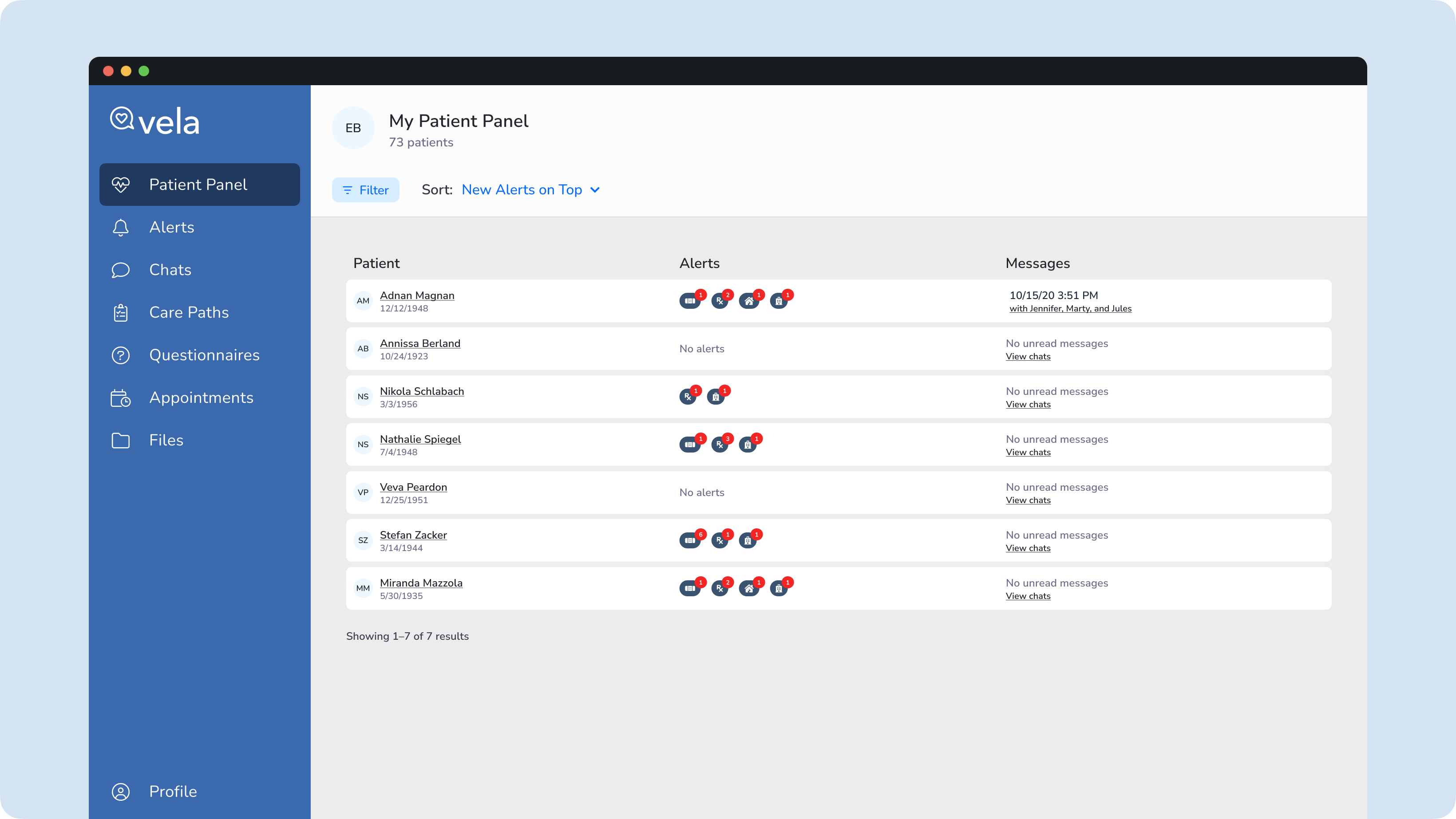
Iteration one

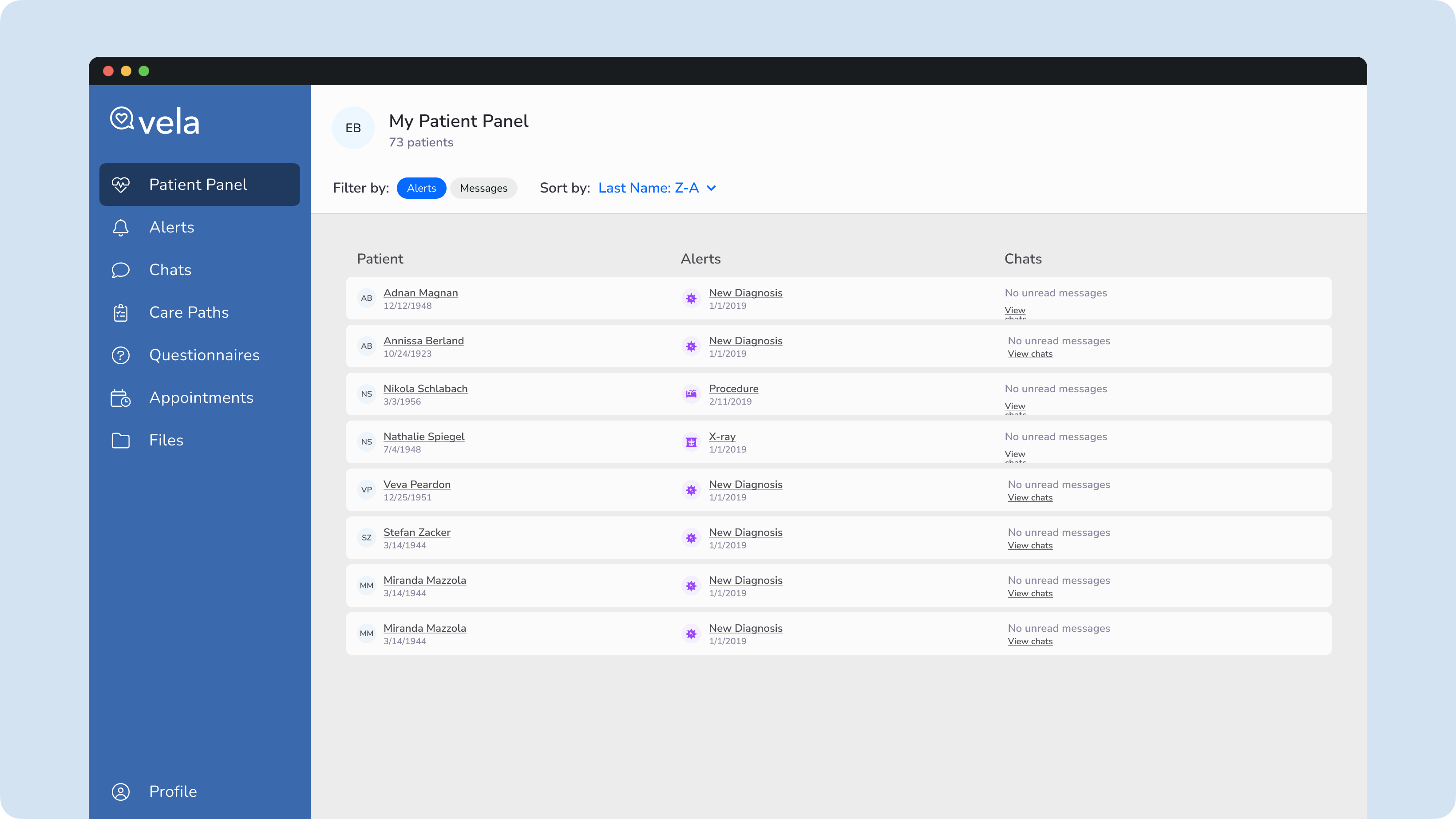
The first iteration of the panel utilized existing components to give the panel a consistent experience—for example, the use of cards as rows and applied filters.

Vela Patient Panel, First Exploration

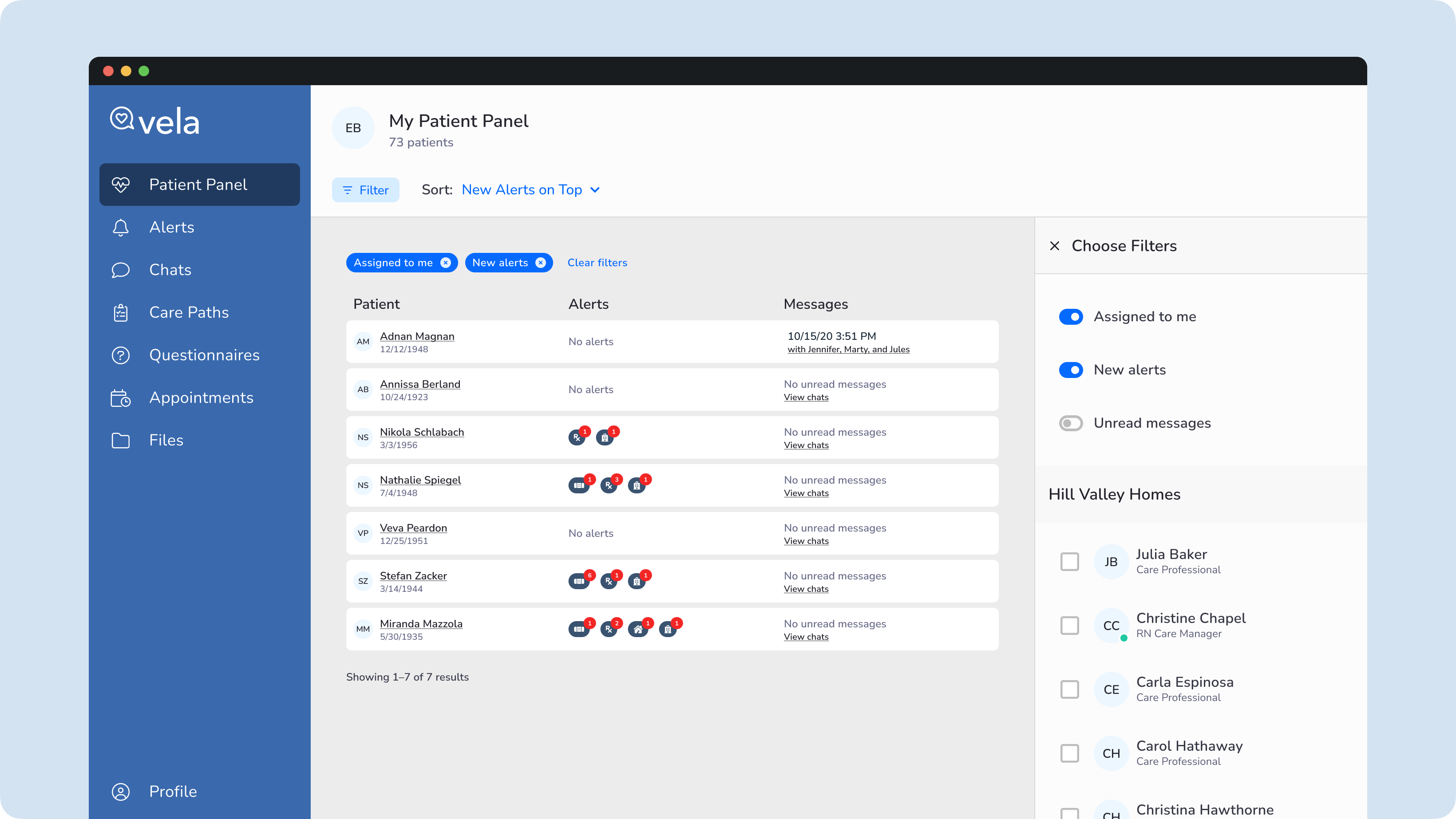
Quick filters exploration

I played around with quick filters with a single click instead of a dropdown menu with higher interaction costs.

Vela Panel: Filter and Sort

Exploring filters and long lists

Filters with short lists are displayed in dropdown menus in Vela Pro. Given many filters have long lists, I experimented with the right drawer.

Vela Panel: Filter and Sort

Iteration two

Sometimes, I build out the experience when working on a project, considering the long-term vision. It helps with story mapping and planning. During the second iteration, I began considering the requirements and design principles the team and I agreed on. The utility menu here accounts for views, filter and sort, and other menu items.

Vela Panel: Filter and Sort

Rule builder filters

My desk research informed me that sentence-style wording, instead of parametric-style, makes it easier for Professionals to comprehend, even if longer.

Vela Patient Panel: rule builder filter

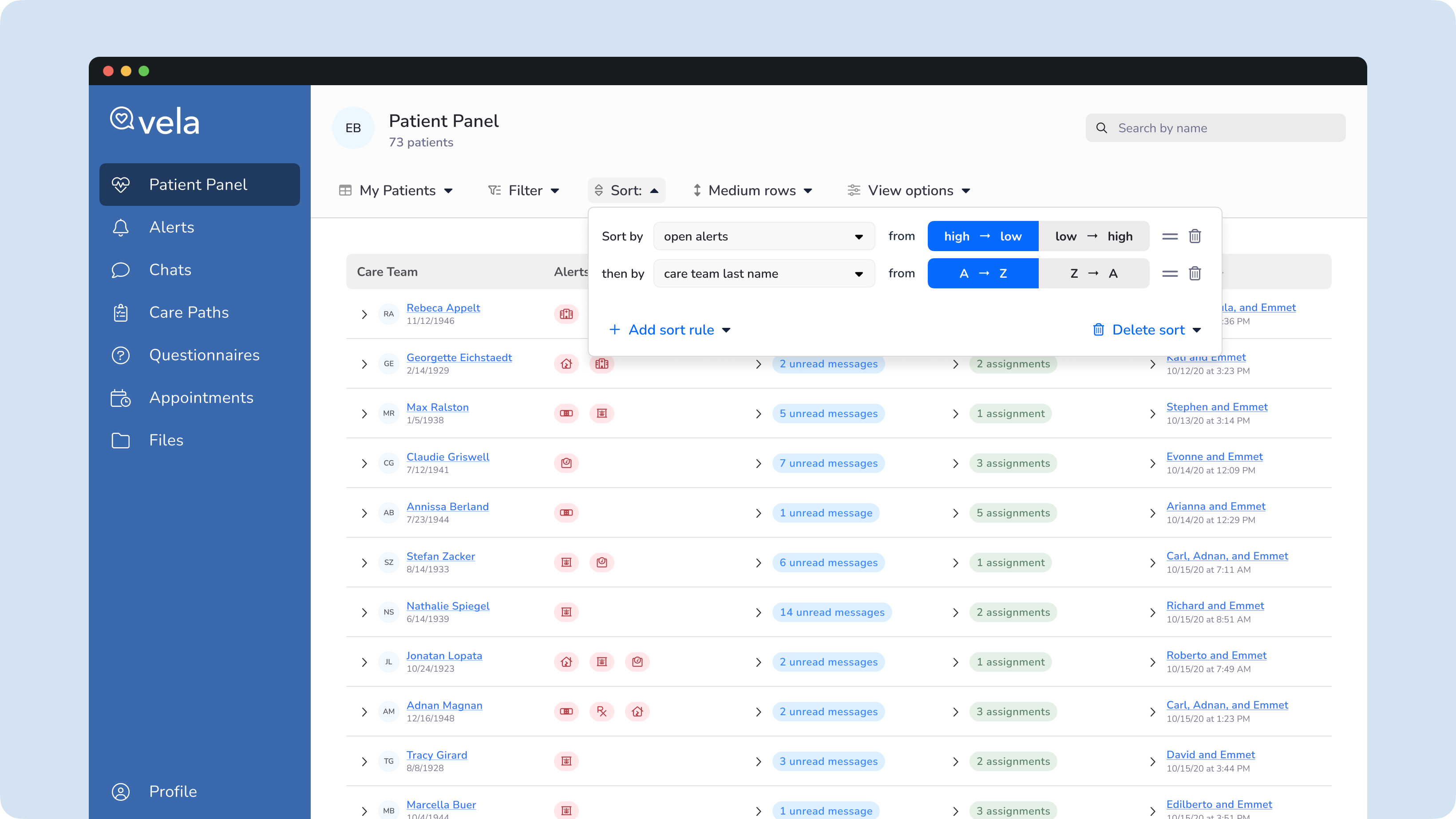
Advanced sorting

In the previous implementation, we allowed the Professional to choose a primary sort and then make some assumptions about the secondary sort. In the future, the Pro will determine the order of her care teams.

Vela Patient Panel: advanced sorting

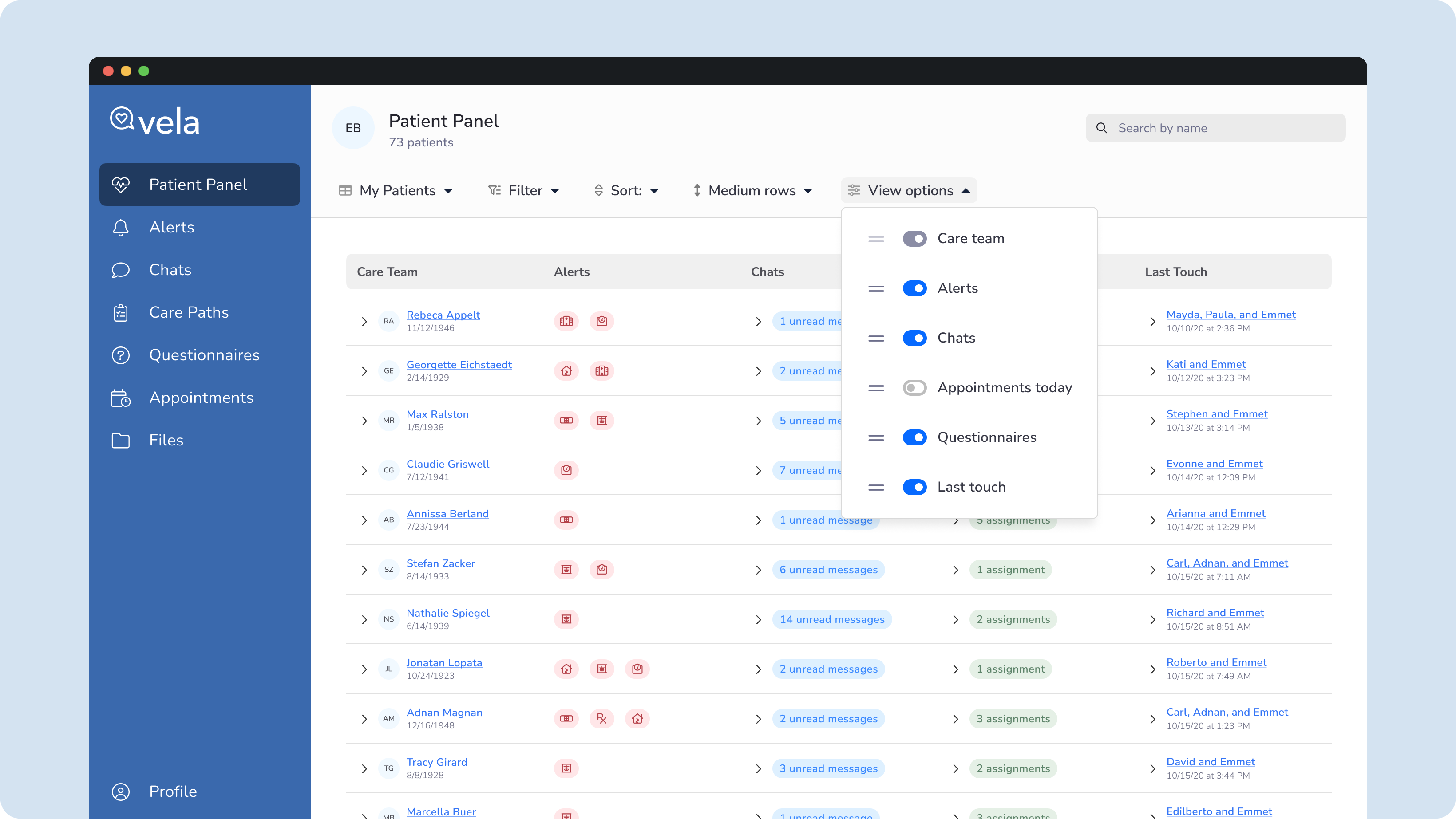
View Options

Data overload would eventually be a genuine concern. Also, some data would be necessary for some Professionals rather than others. They need a way to hide and order panel columns.

Vela Patient Panel view options

Expanded columns

Performance is always a consideration, so I worked closely with my Engineering colleagues. Using the principle of progressive disclosure, we can show just enough data about the care team. With another call, the Professional can access care team data without leaving the panel.

Vela Patient Panel: expanded columns

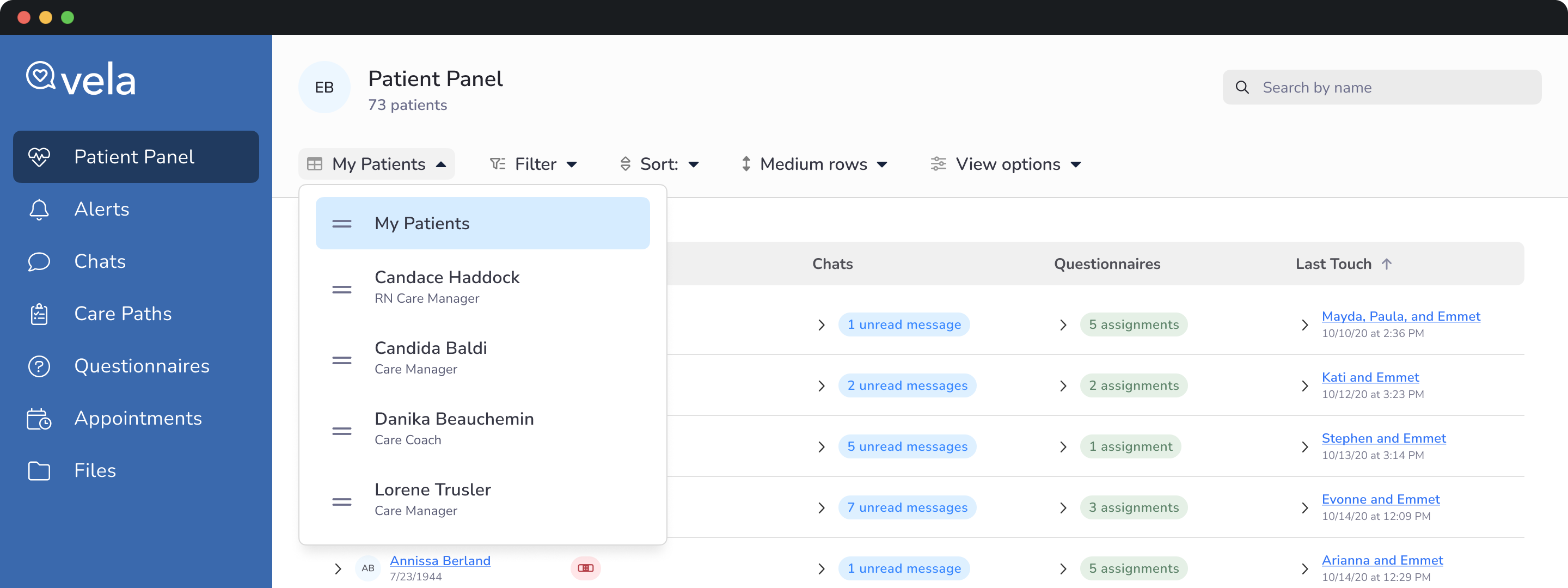
Panel views

Having complex filtering and sorting and the ability to configure fields a Professional cares about is a game-changer. Still, it can be taxing to configure them regularly, even if the application has a memory. Being able to save the settings into a view will be crucial. Of course, the professional needs to be able to rename, duplicate, or delete views.

Vela Patient Panel: panel views

Impact

Before adding the primary filter, Professionals found it hard to determine the care teams' accurate caseload. The filter rule builder has enabled professionals to create personalized experiences tailored to their individual workflows, enhancing their efficiency and allowing them to spend more time with patients.

Lessons Learned

Since the updated panel filters were released, we worked with the Clinical and Client Services teams to identify and implement necessary updates and improvements. We added new filters, and the system has shown its flexibility by enabling the seamless integration of these additional filters.

  • We consulted with the teams to learn what Branch Managers and Care Coaches need.
  • We tested usability with Care Coaches to identify pain points and test our assumptions.
  • We integrated subject matter experts throughout the process to improve outcomes.

My work on dribbble

View featured work on Dribbble you don't see here, including additional Vela work and others.

Go to Dribbble
Vela Product Design