Twine Health Site Redesign

A complete site redesign in only one week

Twine Health Site Redesign

Font Update

Assistant, a contemporary sans-serif font, replaced the less approachable, less legible slab-serif Sanchez. Montserrat, a display font, competed with Assistant and was also removed. Headlines are now initial case, not all caps, to improve legibility.

Colors

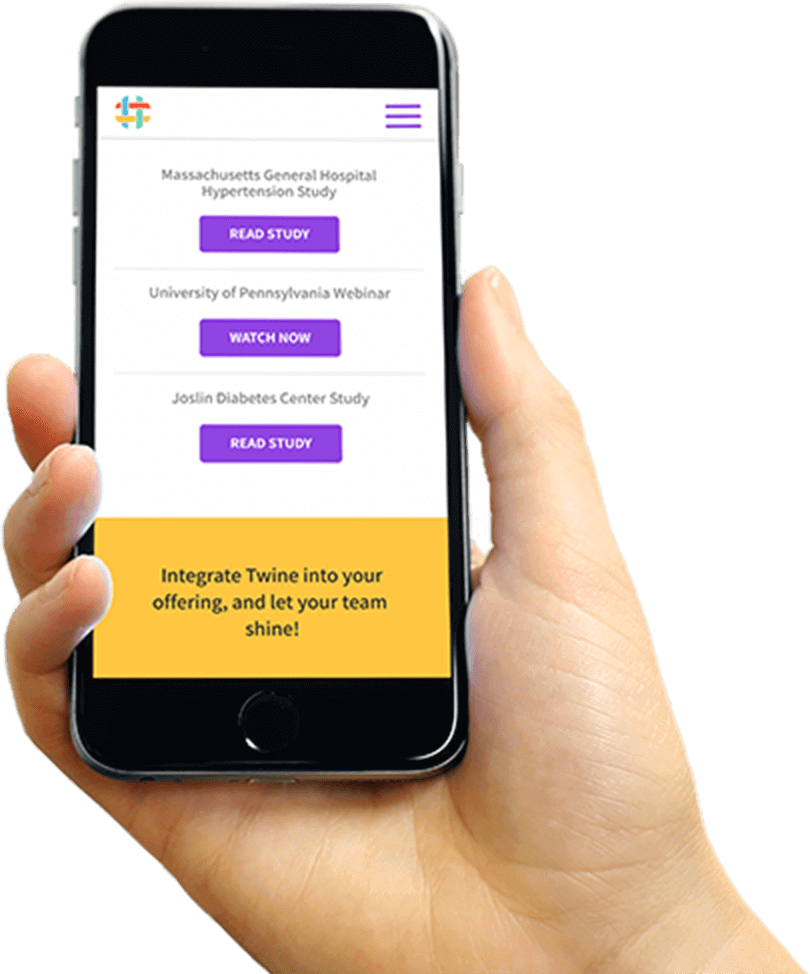
The previous design used the four brand colors throughout. This resulted in a lack of focus, clarity and hierarchy. I added a bright color purple to complement the color palette. This now serves as the color for CTAs such as buttons and links.

Twine Yellow is reserved for banded sections for visitors to complete an action. The rest of the brand colors were omitted to improve hierarchy.

Twine Health Site Redesign: Colors

Imagery

Previously, the site showcased only our platform and was illustrative in nature. This felt cold and impersonal. Now the technology is secondary to the patients; a key value for Twine Health.